Monkeymedia Editorial Team
Case Study: Viladomy Budatín: When Emotion Matters


Contents
- NEWSLETTER
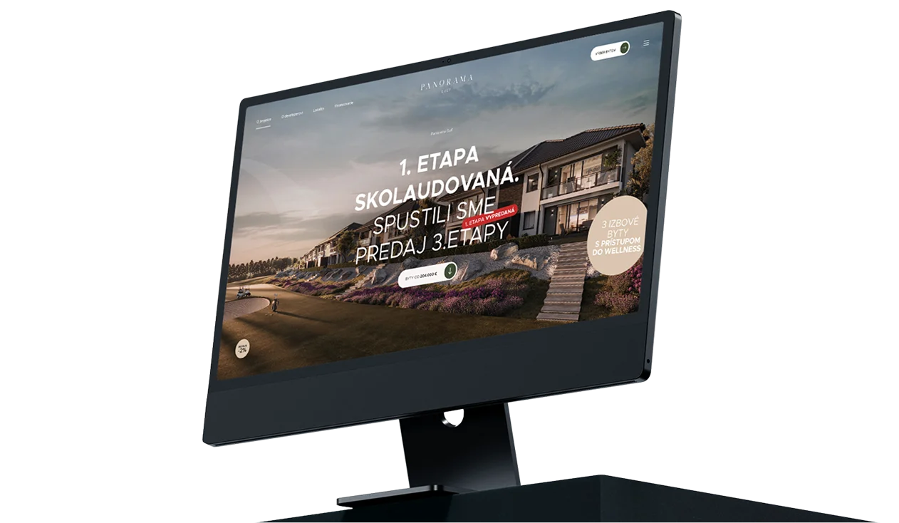
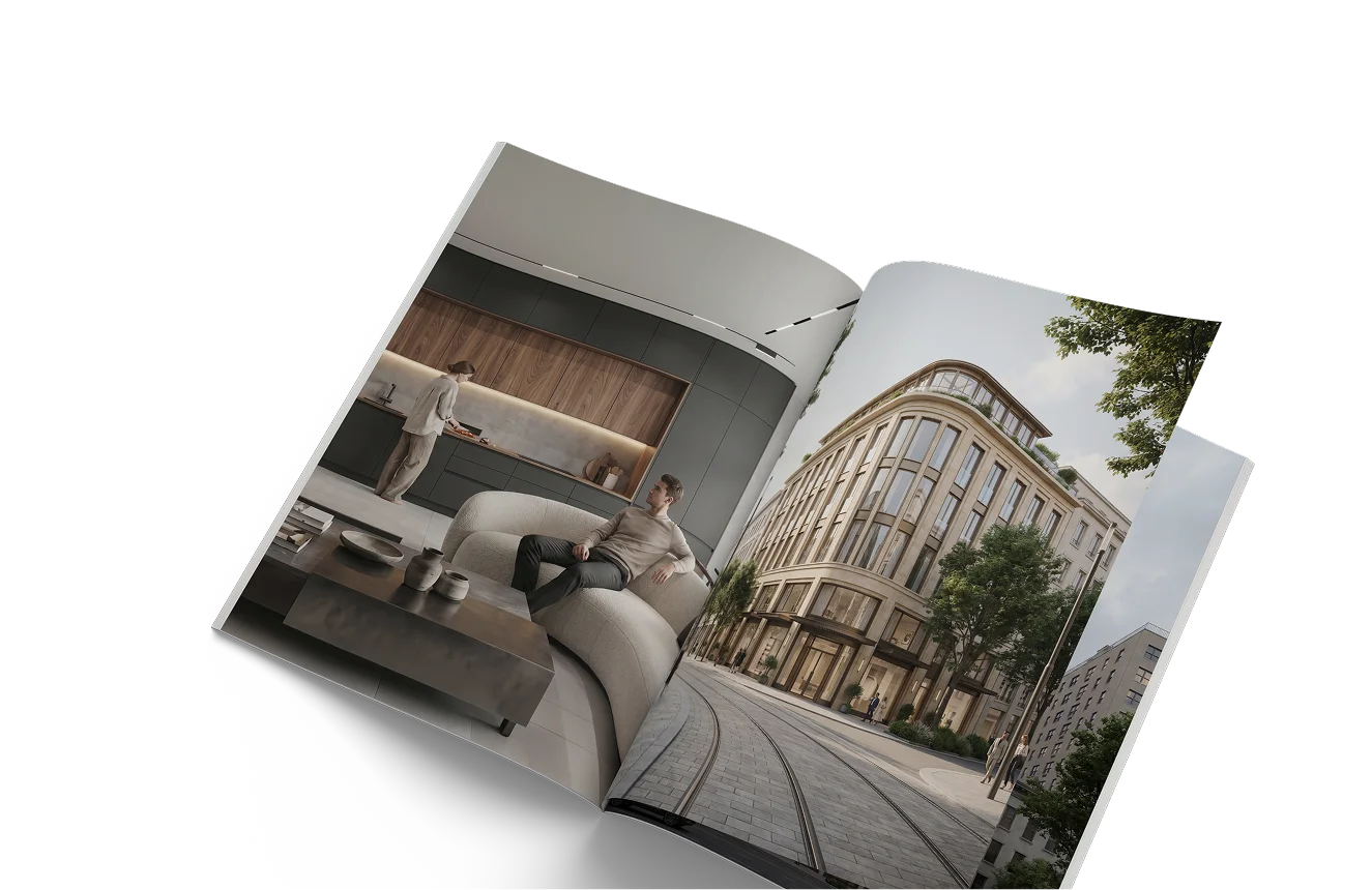
Selling a product for a few dozen euros is one thing, but presenting a new real estate development project and motivating people to reserve an apartment costing hundreds of thousands of euros requires bringing your A-game. Take a look at the website we created for the developer LICITOR DEVELOPMENT for the Viladomy Budatín project.
Viladomy Budatín is a unique project in the heart of Žilina, situated in the midst of nature yet just a stone’s throw from the city. In designing it, the developer focused on an exceptional design inspired by world-class architecture. At the same time, however, they emphasized the highest standard of living, functionality, and sustainability.

The Viladomy Budatín development project is designed to appeal to the most discerning homebuyers in Žilina. Our task was to create a website, which effectively conveys key values And, most importantly, it evokes such a strong emotional response that the prospective buyer will go ahead and reserve the apartment.

You can view the website we created here – https://www.viladomybudatin.sk
Trendy pastel shades
When designing a website with an emphasis on branding We decided to use pastel colors. We chose soft beige background, which has a calming effect. At the same time, however, it conveys a sense of luxury and premium quality. Last but not least, it evokes the natural character of home life and environmental sustainability.

Of course, the purpose of the website is not simply to present the project aimlessly, but to motivate visitors to convert. Drawing on our UX expertise, we’ve added buttons to individual pages that we’ve distinguished from the rest of the content highlighted them with a contrasting pastel green color. They immediately catch the eye.
Visualizations That Evoke Emotion
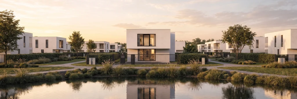
We have incorporated the following into the website's structure 3D visualizations, which show not only the object itself, but as well as the surrounding infrastructure – greenery, families with children, parked cars, or a view of the property at night.

These visualizations encourage website visitors to start thinking about, What his life would be like in the Viladomy Budatín project. They thus evoke a strong emotion, which is a prerequisite for conversion.
Clear Content Structure
We have organized the key information about the project into several logical sections to make it as clear and understandable as possible. When creating the content, we dmade extensive use of icons, which make the individual sections even clearer.

We have posted the following on the website's home page: Map of the area surrounding the Viladomy Budatín project, in which we interactively displayed the most important elements of the surrounding infrastructure—a school, a post office, a supermarket, as well as a soccer stadium and an observation tower.
Easy Apartment Reservations
To make the reservation process as easy as possible, on the page where you can select an apartment, we have added a 3D visualization. In it, a prospective buyer selects a floor with a single click and then simply chooses the apartment they are interested in from the floor plan. The most important information is displayed, and by filling out a short form and submitting it, they express their interest in making a reservation.
We are delighted to be part of such interesting projects and We believe the apartments in the Viladomy Budatín project will sell like hotcakes!
- RECOMMENDED
You might also like

  September 22, 2026
  September 22, 2026
  September 22, 2026