


- CASE STUDY
Pharminfo
Healthcare, Pharmacy
A company focused on digital solutions, health data management and information systems for the pharmaceutical and healthcare sectors.
A company focused on digital solutions, health data management and information systems for the pharmaceutical and healthcare sectors.
- SCOPE OF OUR WORK
A brief summary of the specific services and activities we have provided for the client.
Visual identityLogoTypographyWeb

- PROJECT OVERVIEW
PharmINFO operates ADC Číselník, a central database of more than 35,000 pharmaceutical products used by almost every pharmacy in Slovakia. The system reaches 3.7 million users and records 60 million views each year. “Data you can rely on.”

Design
process
1
Discovery
Analysis of how B2B customers perceive PharmINFOIdentifying gaps in the existing identityPositioning as a technology leader in Slovakia’s pharmaceutical market2
Strategy
Modern technology identity with a dynamic gradientWebsite with a clear structure for the B2B product portfolioCommunicating the systems’ precision and reliability3
Solution
New logo and complete visual systemWebsite optimized for B2B customersTypography system and brand guidelines- THE CHALLENGE
PharmINFO operates ADC Číselník, a key system used by pharmacies across Slovakia. Despite its strong market position, its identity and website did not reflect the technical quality of its products. The challenge was to create a modern presence that would strengthen trust in the brand and support further growth in the B2B market.
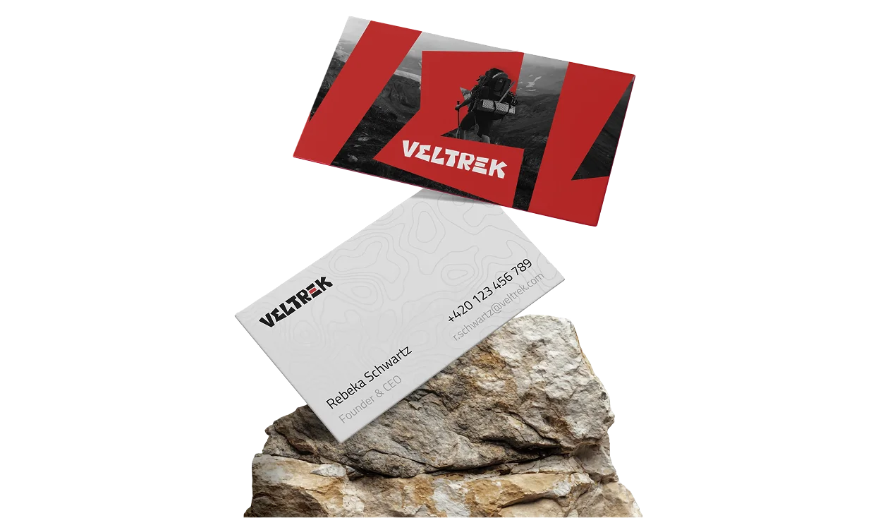
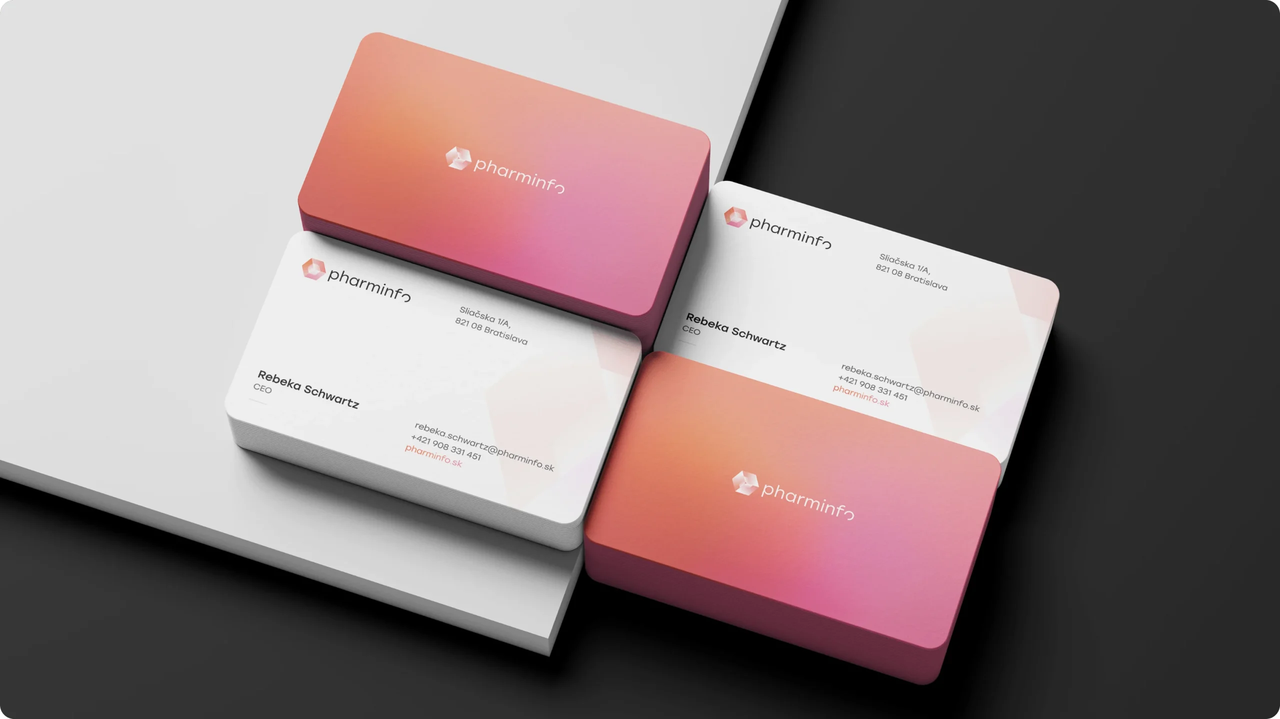 Business cards
- IMPACT
The new technology-led identity and redesigned website strengthened PharmINFO’s position as a leader in Slovakia’s pharmaceutical market and made its products easier to present. The result is a more modern, credible brand, with perceived trustworthiness rising by 58%.
- PHARMINFO IN NUMBERS
Users
3.7M
annual system users
Views
60M
annual views of the pharmaceutical portal
Trustworthiness
+58%
after rebranding and the new website launch


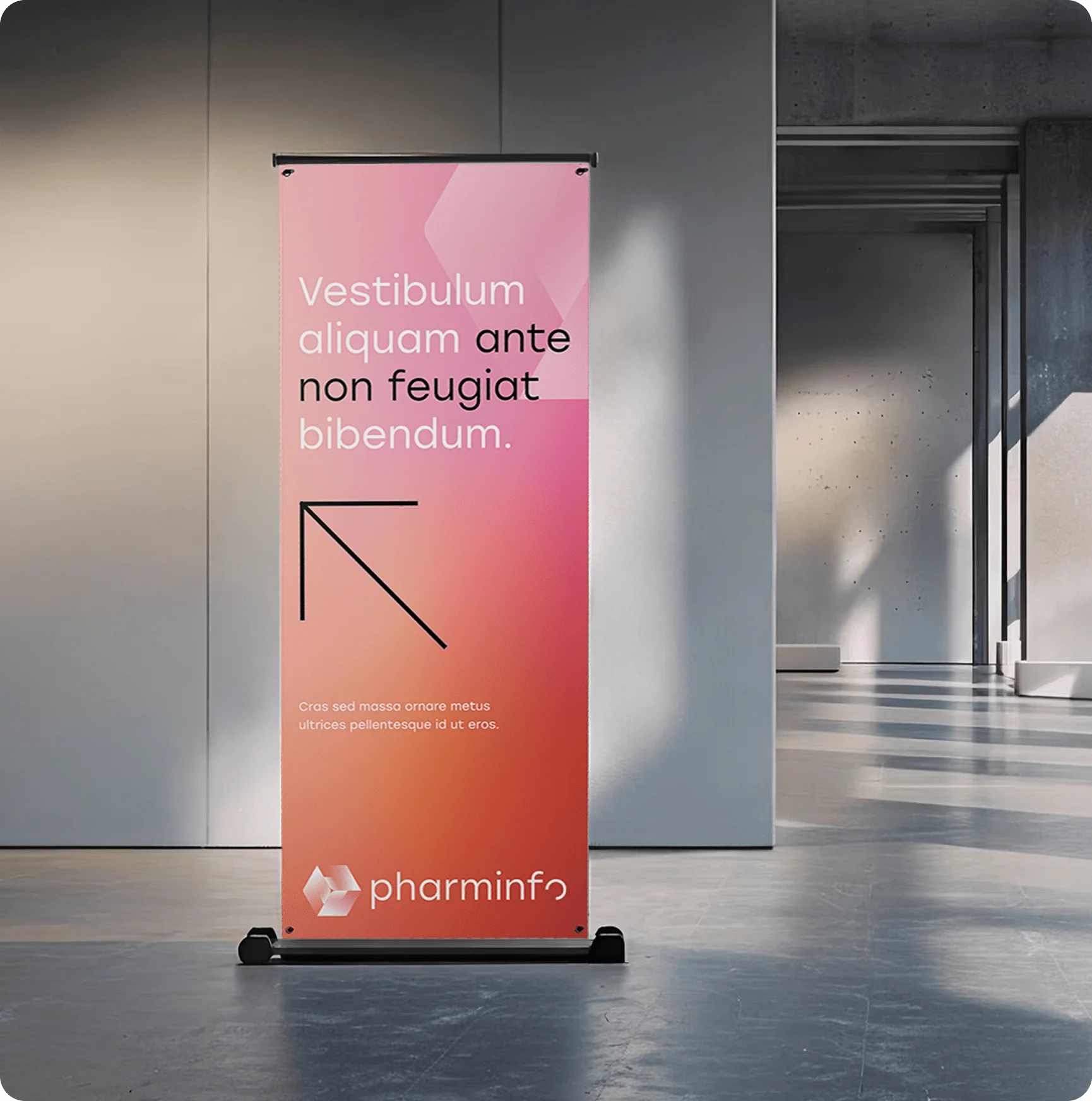 Roll-up banner
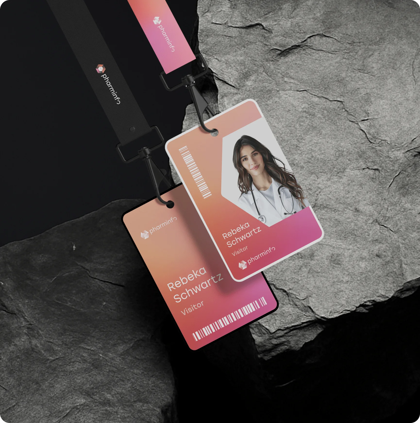 Lanyard
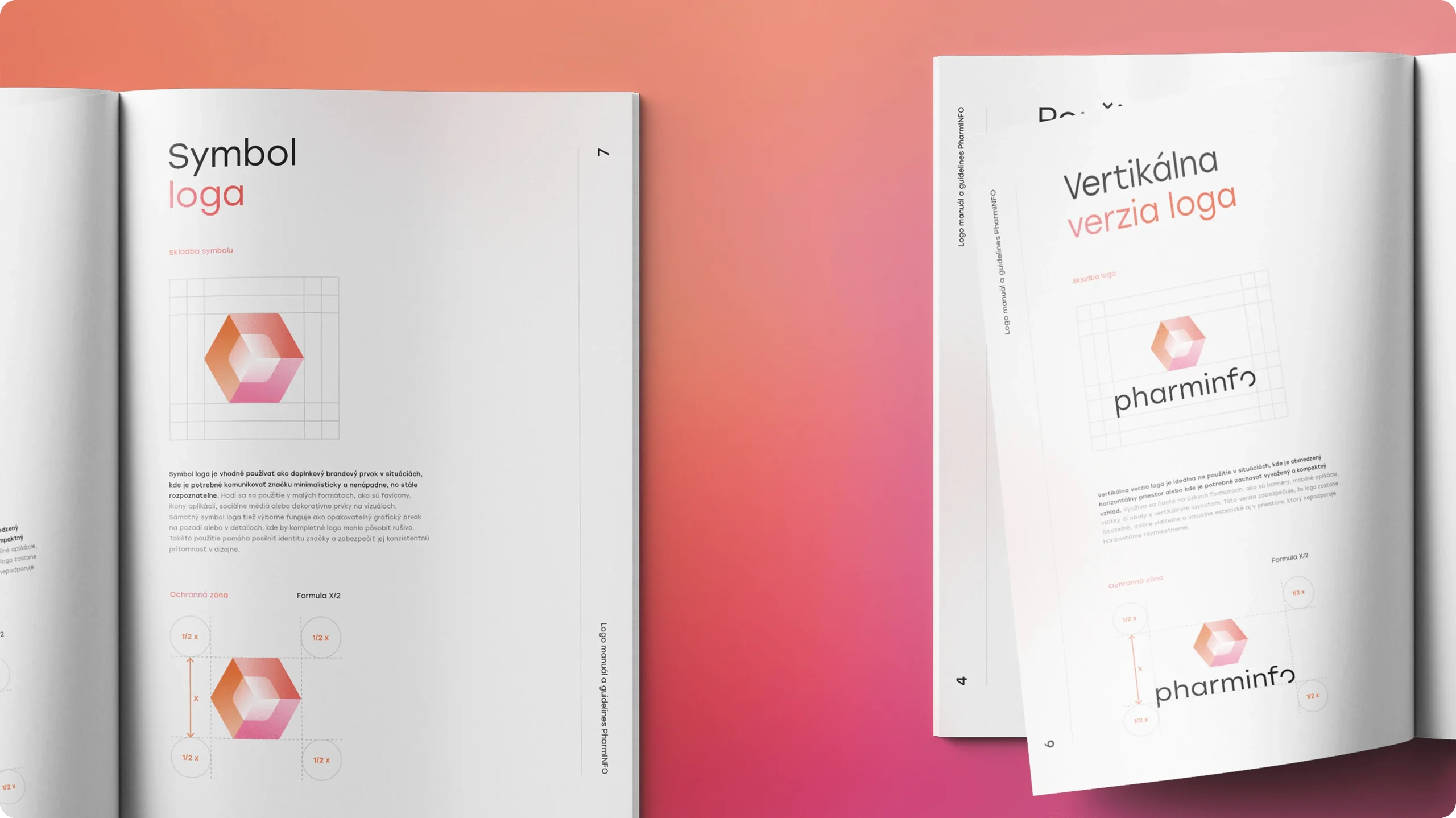 Visual identity
 Logo
Logo Logo
Logo Logo
Logo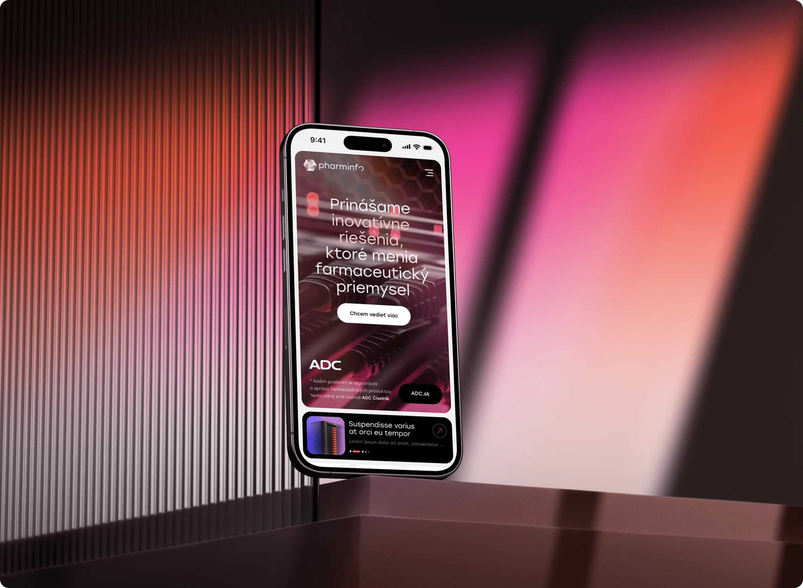 Web
Web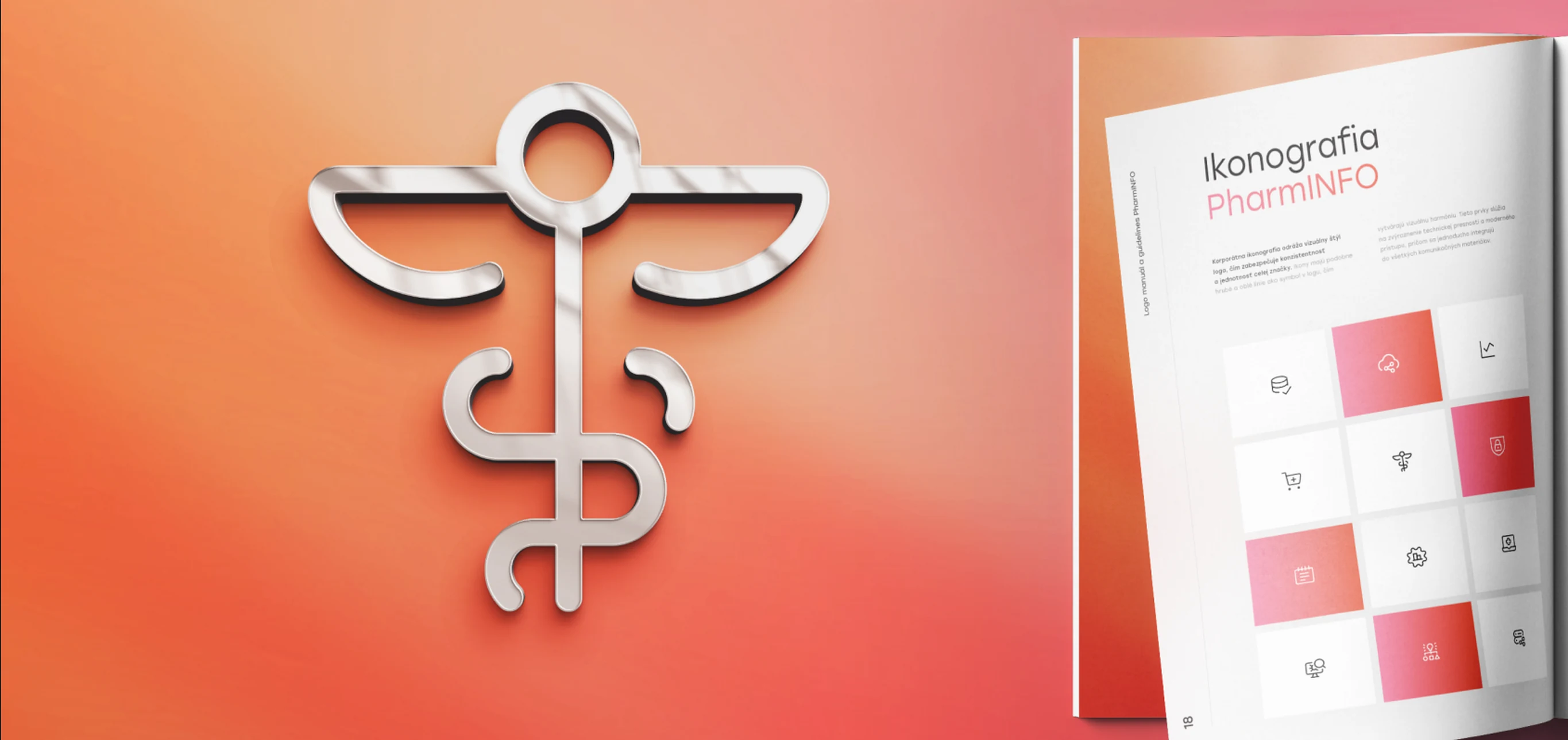 Iconography
 Brand identity
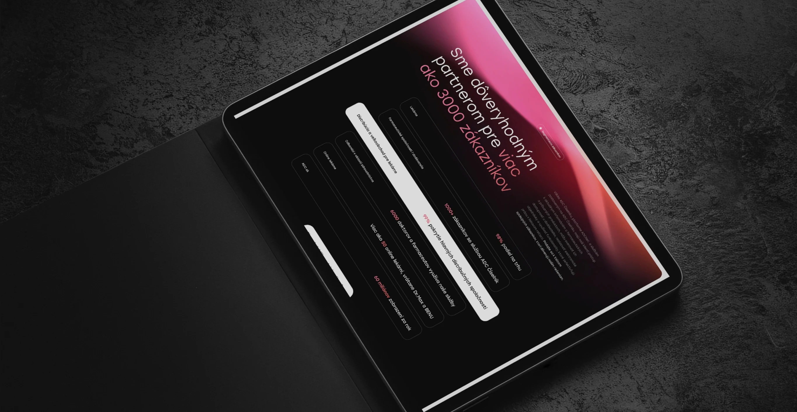 Web
Web Logo
Logo

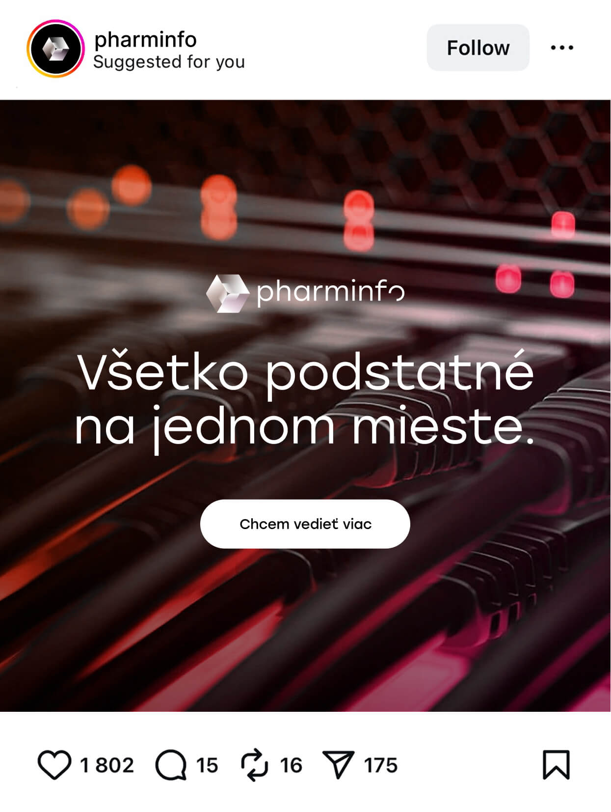
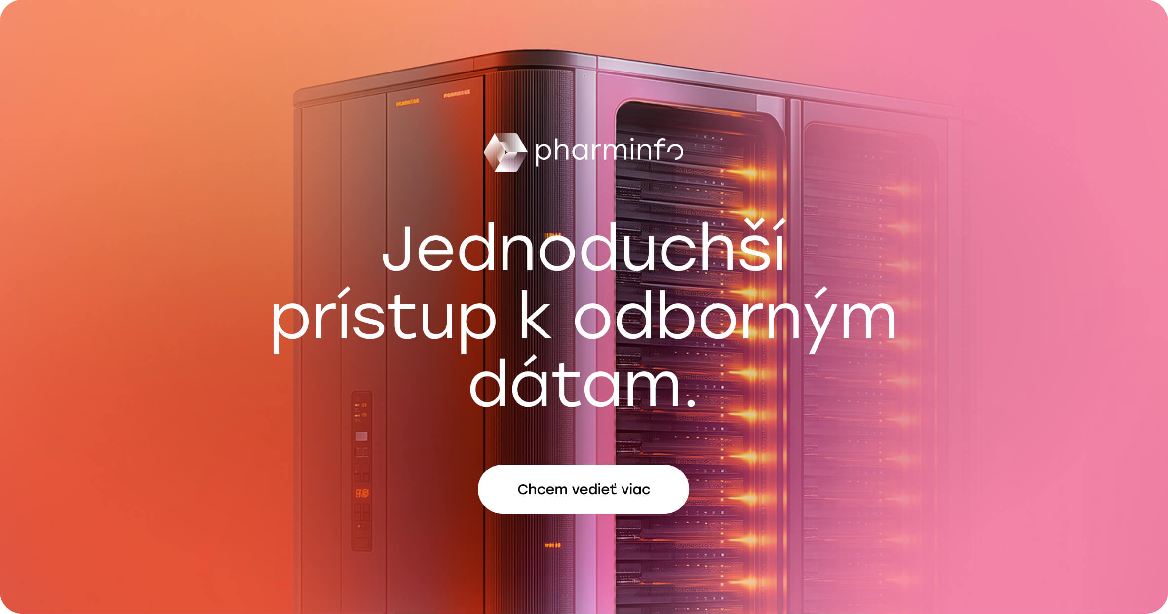
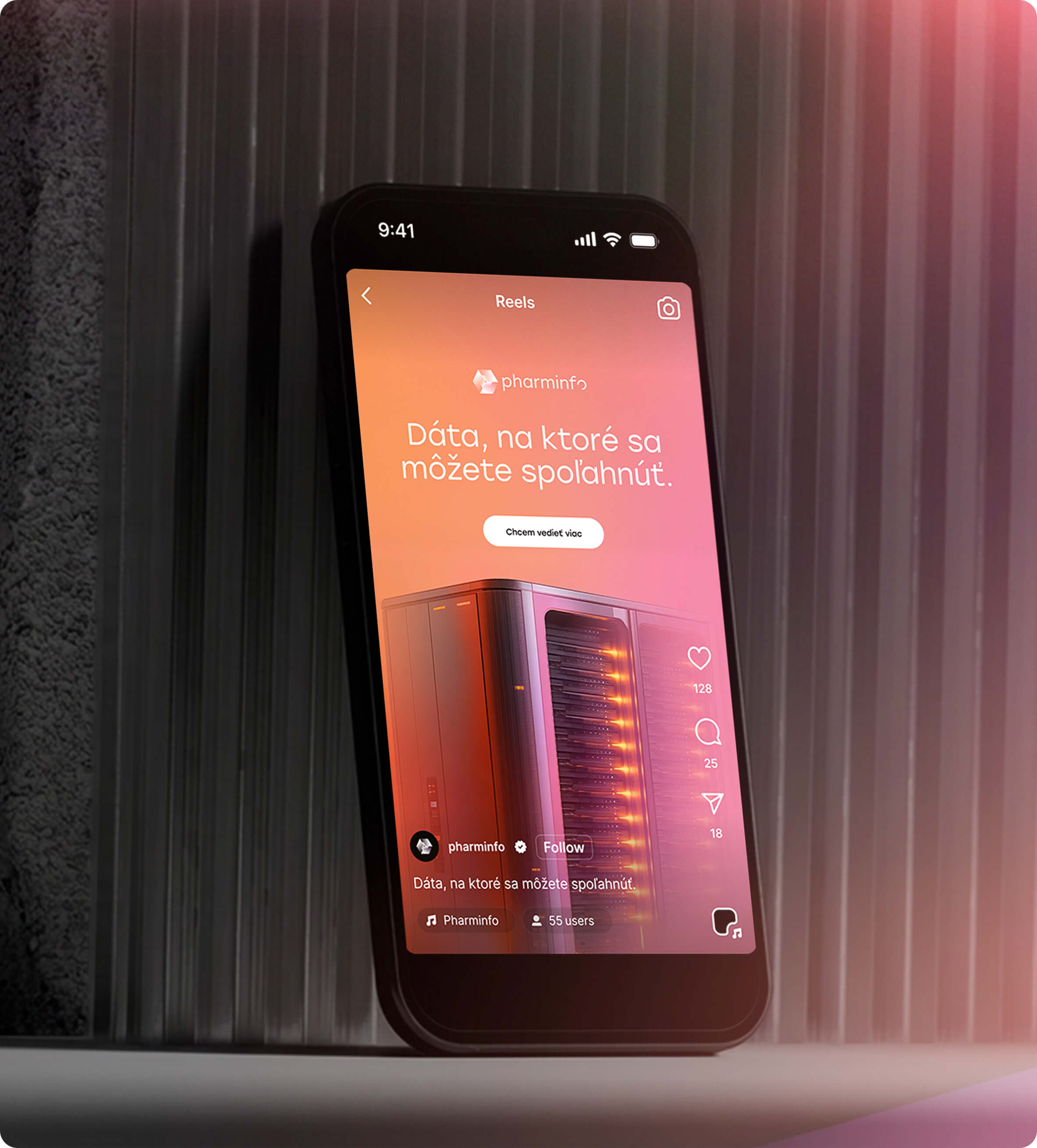
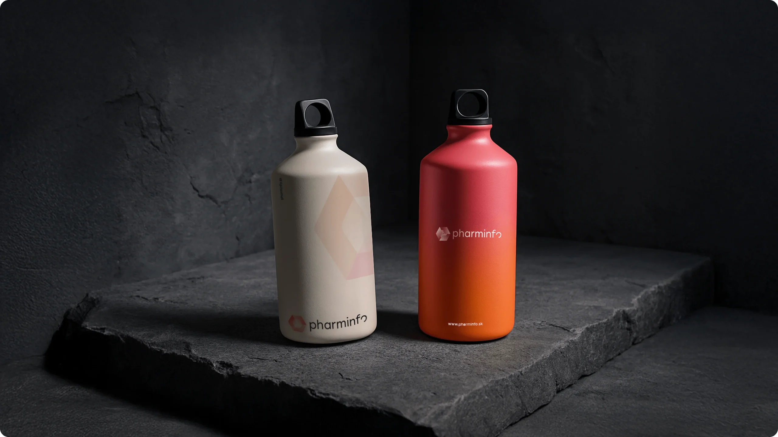 Promotional merchandise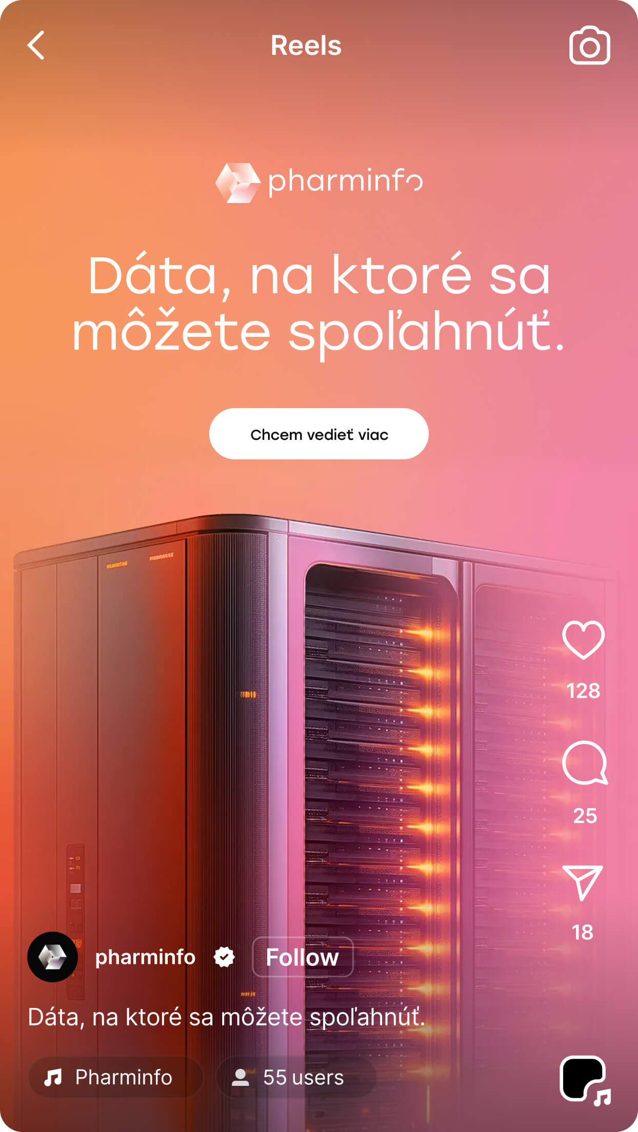
- RECOMMENDED
More case studies
HOTEL POD LIPOUHotelWeb
CukrovarDevelopment projectSocial

NEOREALReal estate agencyWeb design