


- CASE STUDY
Rinex
Renovations, construction, technical solutions
Comprehensive construction and technical solutions for modern buildings and industry, designed with an emphasis on quality, functionality, and reliability.
Comprehensive construction and technical solutions for modern buildings and industry, designed with an emphasis on quality, functionality, and reliability.
- SCOPE OF OUR WORK
A brief summary of the specific services and activities we have provided for the client.
Visual identityLogoWebBranding
- PROJECT OVERVIEW
RINEX provides comprehensive construction and technical solutions with an emphasis on quality, functionality, and reliability. Our work focused on creating a new, clearly recognizable brand identity, from the logo and complete visual system to a new website. The goal was to unify how the company presents itself and create a professional image that reflects the quality of its projects. The result is a modern, consistent identity that helps RINEX communicate its services more clearly and build a credible position in the market.

Design
process
1
Discovery
Definition of RINEX’s market positionAnalysis of services, target audiences, and competitorsIdentification of the brand’s values and key attributes2
Strategy
Development of a new visual and communication identityDefinition of a consistent brand directionDesign of the structure and approach for the digital presentation3
Solution
Complete visual identity and a new logoCustom modern websiteConsistent visual system for future communication- THE CHALLENGE
RINEX had extensive experience and high-quality projects, but its visual presentation did not reflect the standard of its services. The brand lacked a clear, consistent identity that would represent it professionally and distinguish it in the market. Its communication was visually fragmented and did not provide a strong enough foundation for further growth. The challenge was to create a new identity and a modern digital presence that would increase credibility, present its services more clearly, and support future growth.
- IMPACT
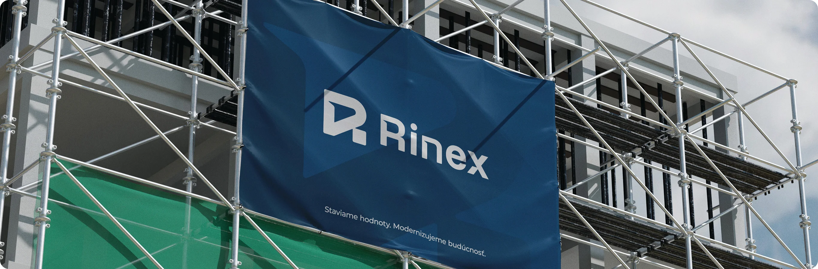
The new visual identity gave RINEX a clear, professional, and recognizable character that better reflects the quality of its services and projects. A unified brand system also created a strong foundation for consistent communication across all materials.
The new website provides a clear digital presentation of services and references, enabling RINEX to communicate its expertise and experience more effectively. The result is a more credible brand presence, stronger portfolio presentation, and a better market position.
- RINEX IN NUMBERS
Web
1,9x
faster website load time
Brand recognition:
+56%
increase after launching the new website and identity
Trust
+39%
perceived credibility


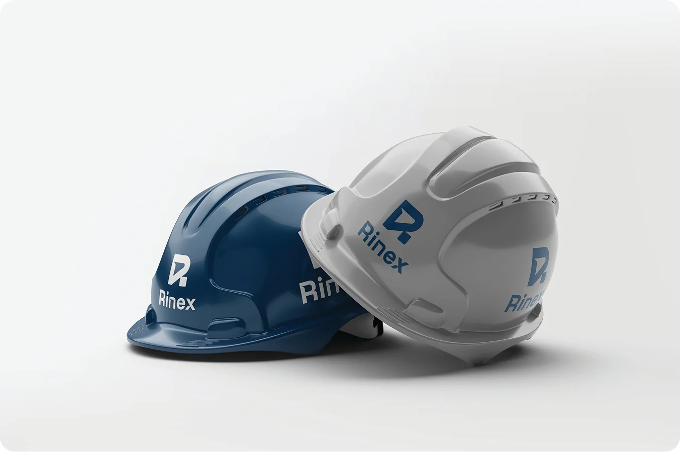 Promotional merchandise
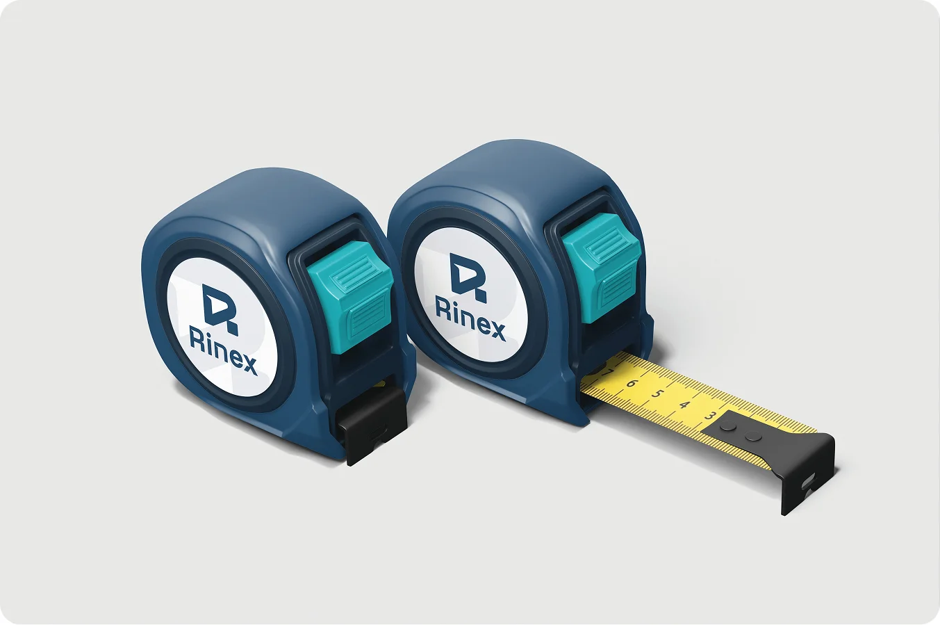 Promotional merchandise
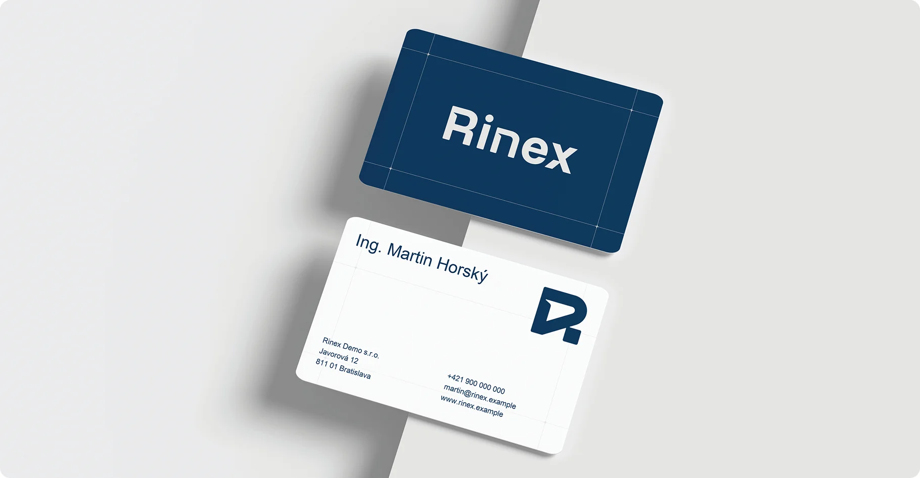 Business cards
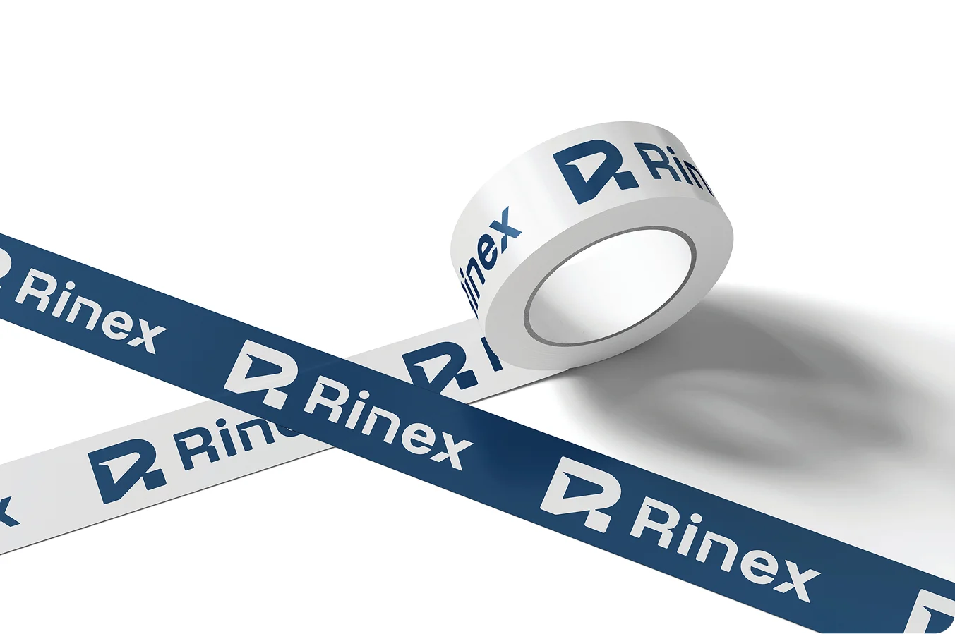 Promotional merchandise
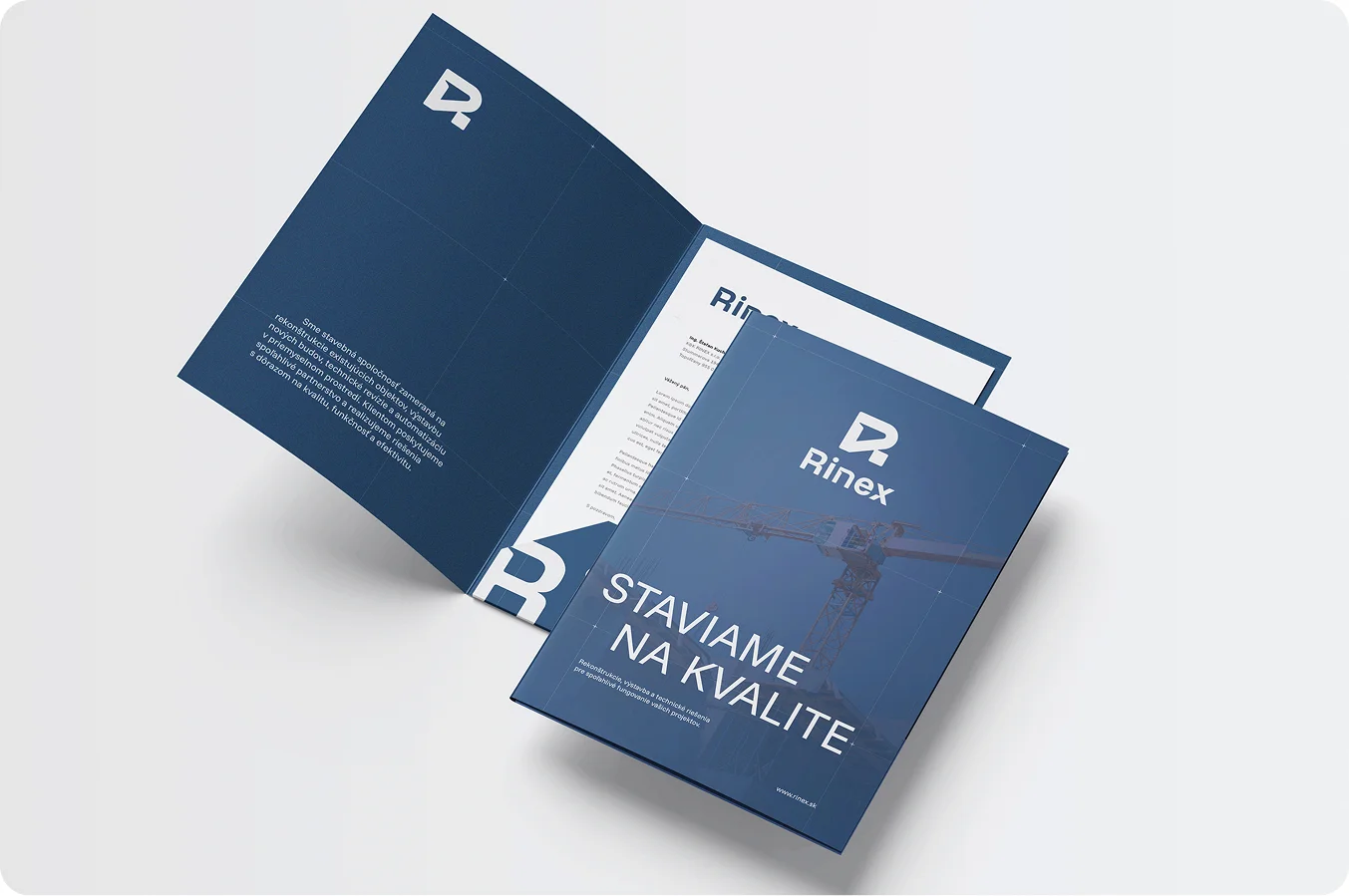 Presentation folder
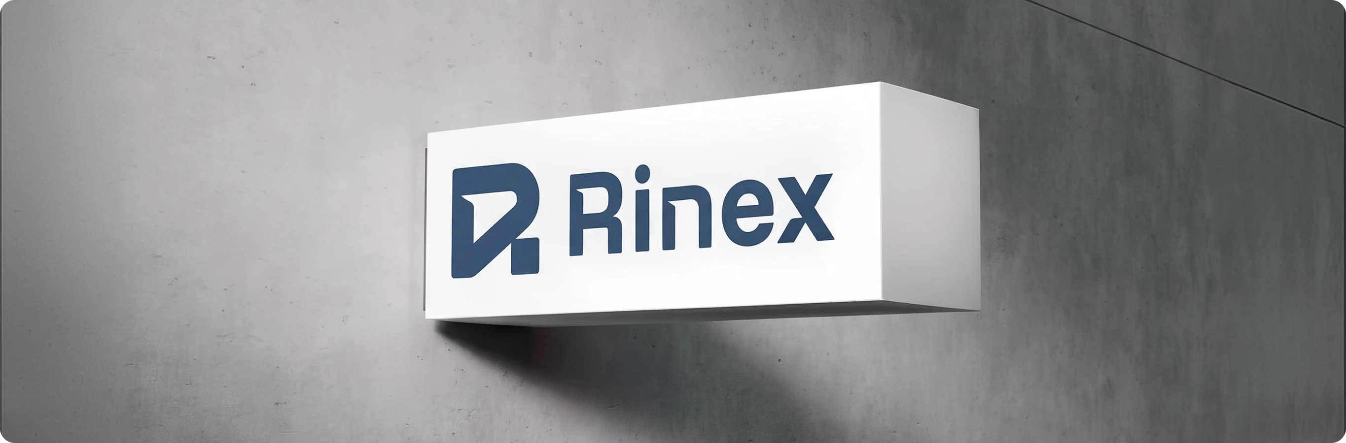 Logo
Logo
 Logo
Logo Logo
Logo Logo
Logo
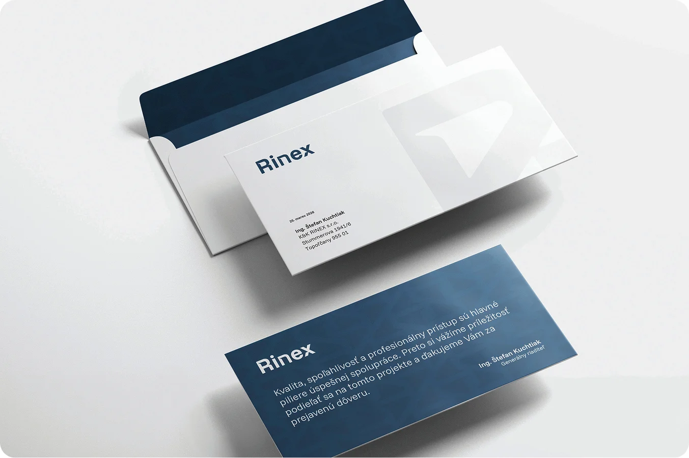 Promotional merchandise
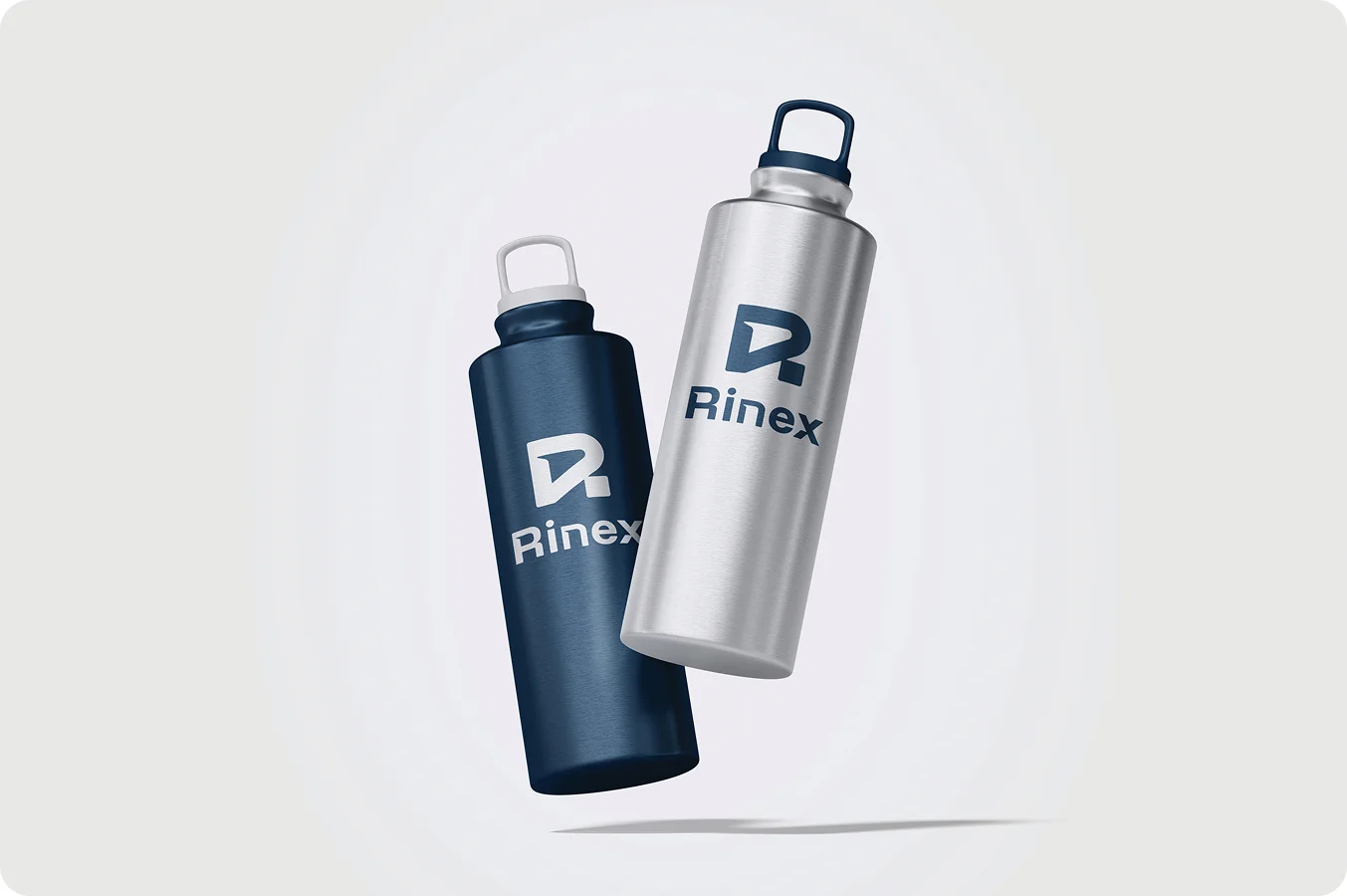 Promotional merchandise
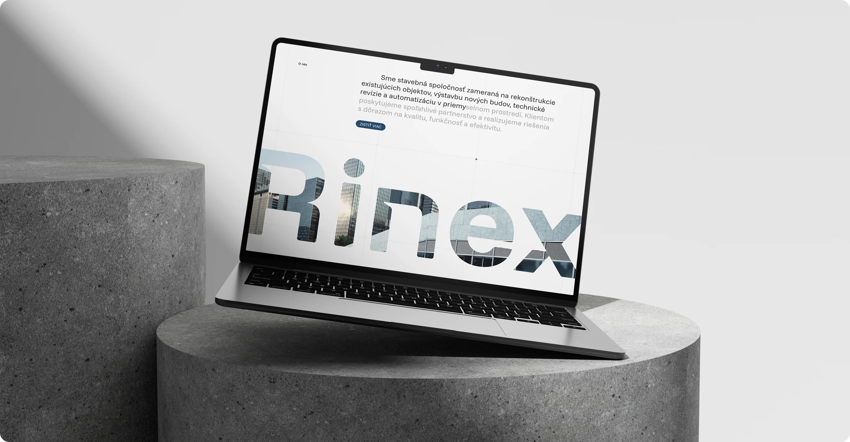 Web
Web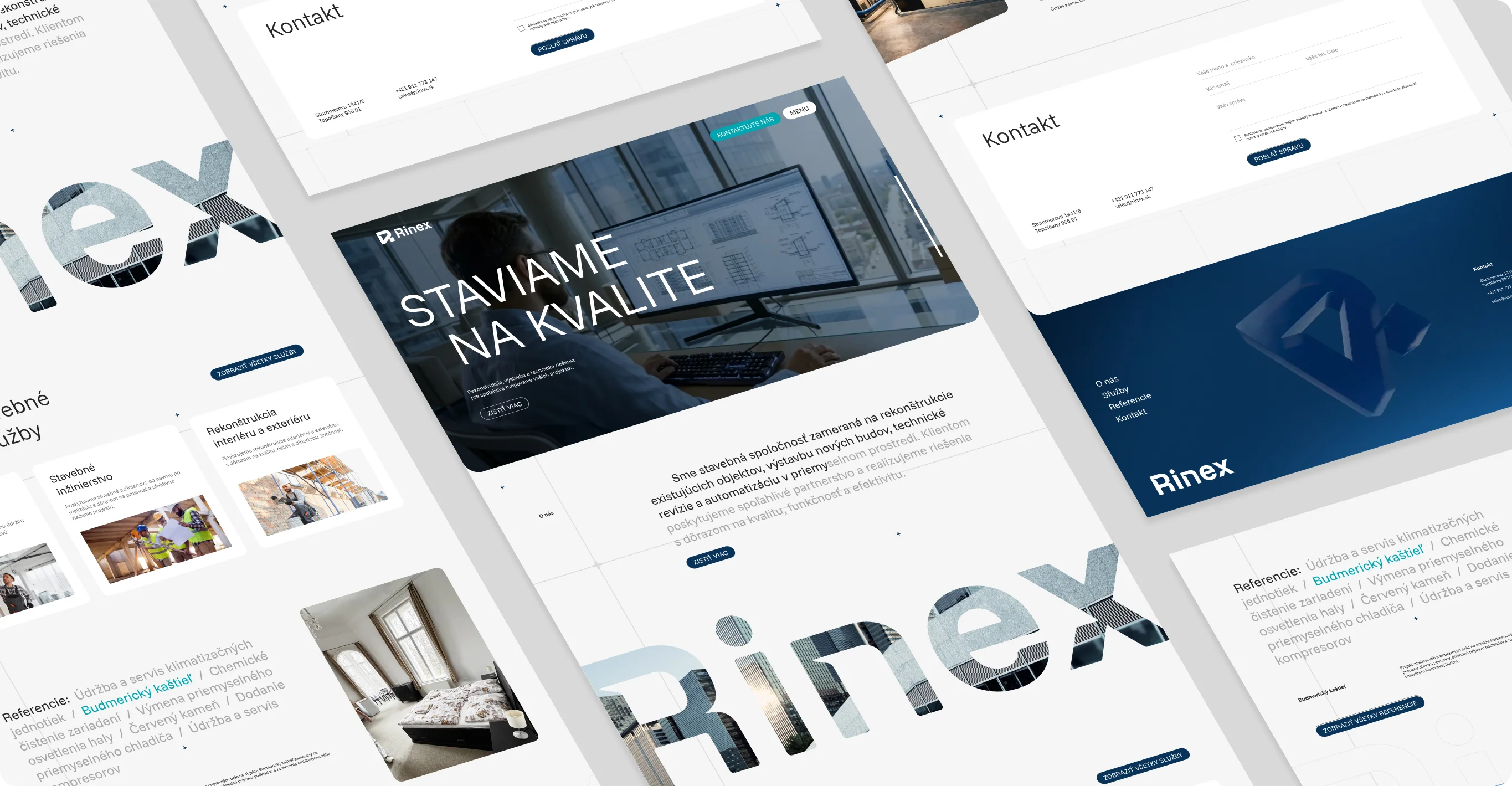 Web
Web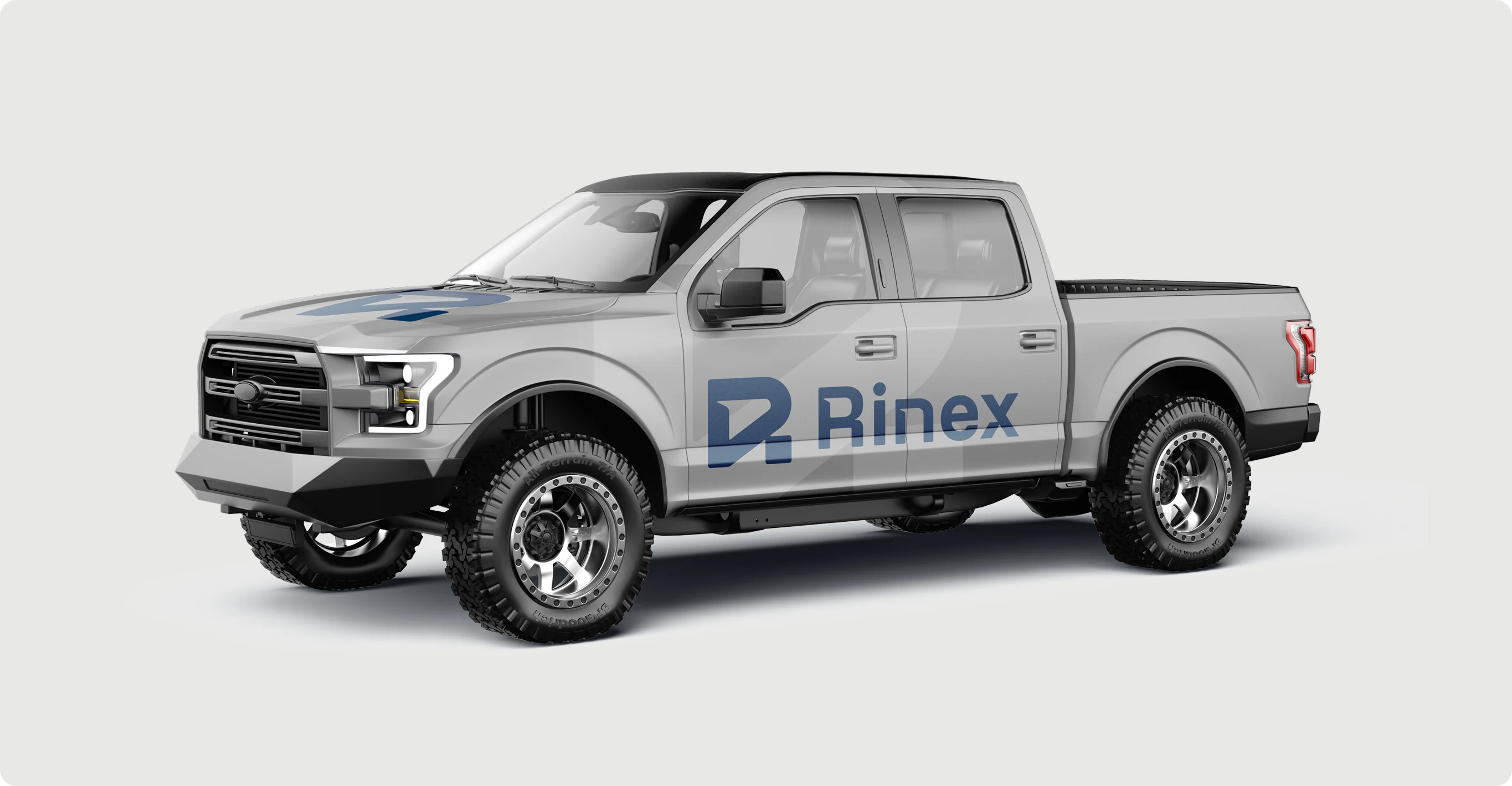 Vehicle wrap
 Logo
Logo
LogoLogo
 Logo
Logo
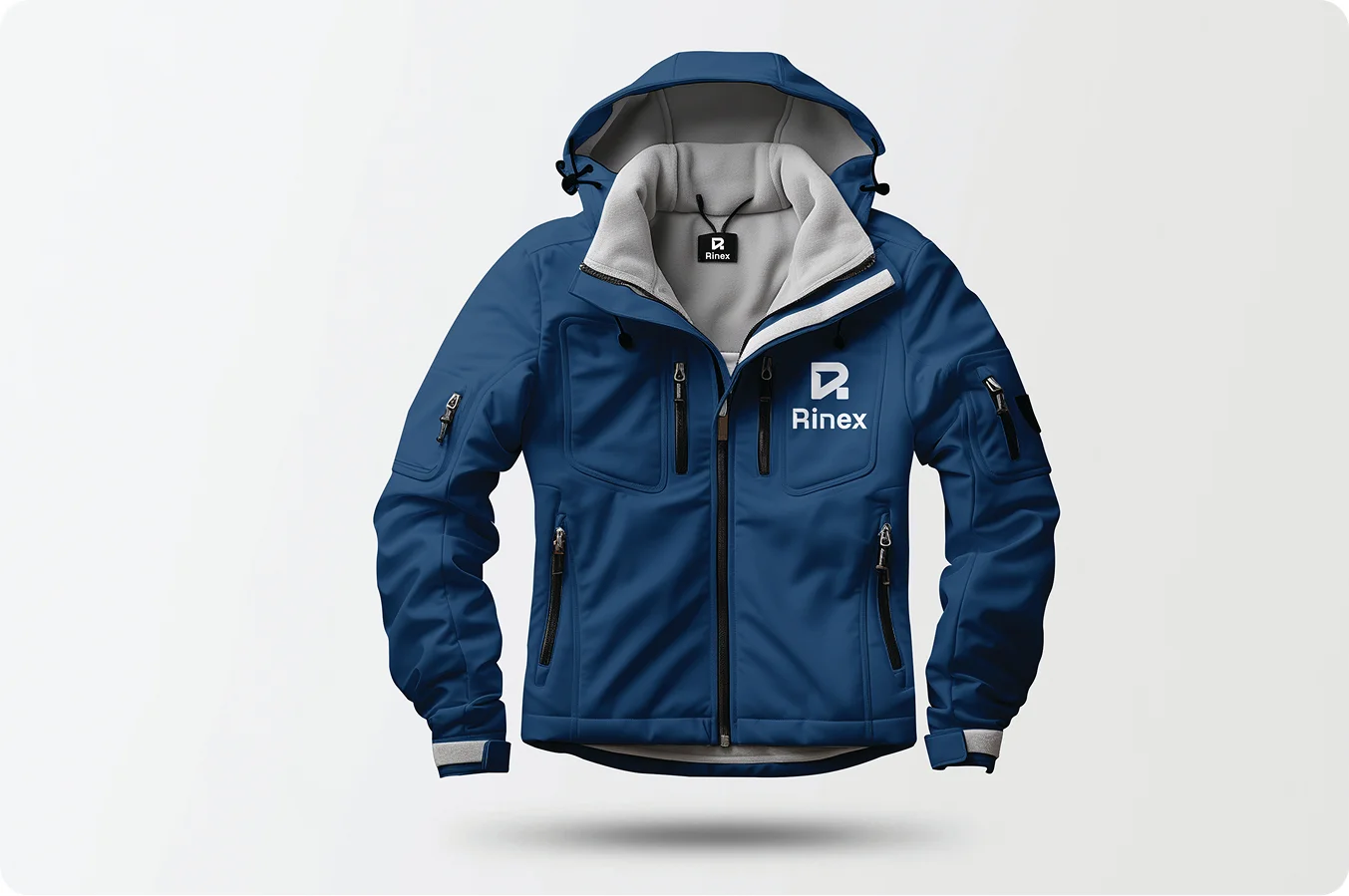 Promotional merchandise
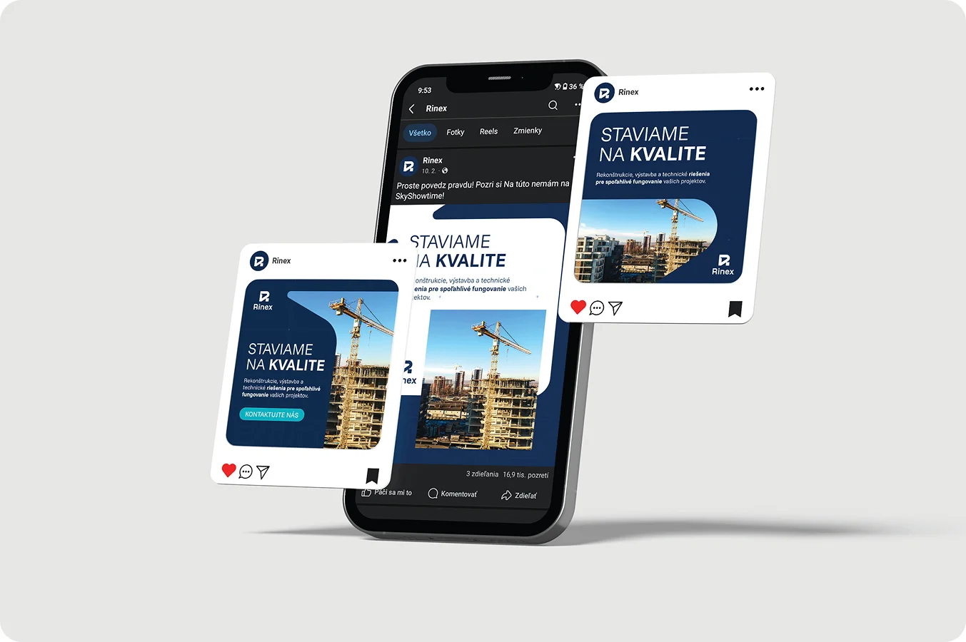 Social media
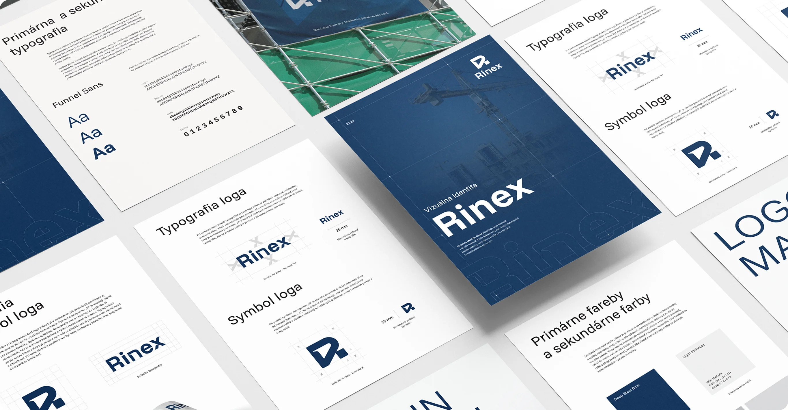 Brand identity
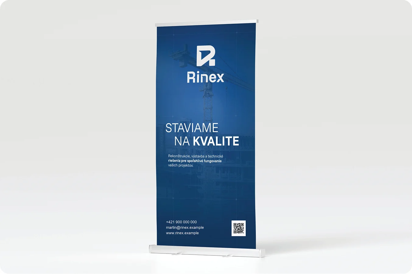 Roll-up banner
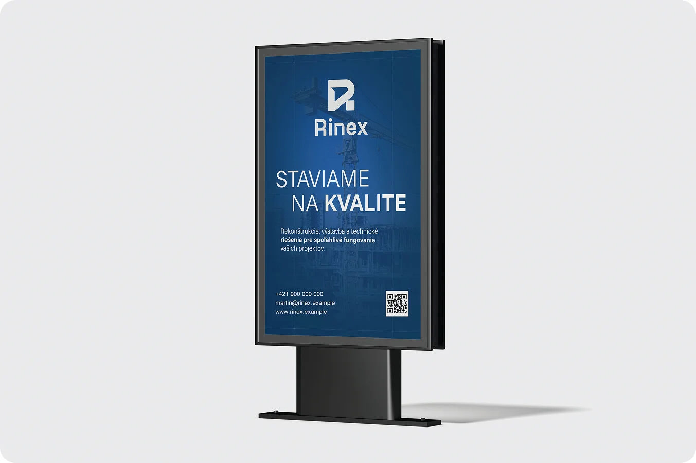 Citylight poster
- RECOMMENDED