









Monkeymedia Editorial Team
The Secret Power of Colors: How to Influence Customers Through Graphic Design


Contents
- NEWSLETTER
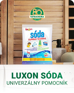
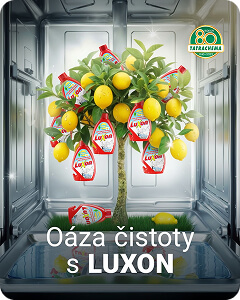
Colors are an integral part of our everyday lives. In graphic design, they are even more important—they influence how we perceive brands, whether we remember them, and what emotions they evoke in us.
I'd like to present this topic to you in a slightly more entertaining and practical way. I reached out to our designers Simona and Mária. The guys not only told us about how colors work, but also shared a few interesting examples from their work. Make yourself a cup of coffee, sit back and relax, and join us to see just how powerful colors can be!
Do you think that color psychology is the key to success in graphic design?
Simon:
„Definitely yes... at first glance, it might seem like it doesn't matter—that whatever looks nice works—but that's not quite the case. Colors in design affect people primarily in a way that the customer is often completely unaware of, and they influence the overall impression somewhere in the background of human perception—simply on a subconscious level. Can you even imagine McDonald’s using a color palette other than red and yellow? … No… you can’t. And if you can, it’s a terrifying thought 😀 The key to success is always knowing what you’re doing, for whom, and who your target audience is. Your success depends on that—and not just when it comes to choosing colors.“
Mário:
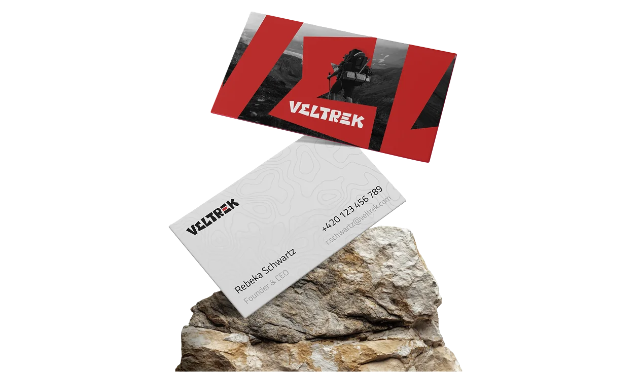
„We can use colors to convey what words often fail to express. For example, when brand identity Colors help shape a product’s character and convey the brand’s identity that we want to communicate to people. By following the right procedures when selecting color palettes, we can differentiate the brand, elevate it, highlight its uniqueness, and amplify the overall emotional impact, thereby making the brand or product more attractive and understandable to the public. When selecting colors, we always focus on ensuring that the product appears modern and timeless and has the ability to reach the right audience.“

In your opinion, which colors work best for evoking an emotional response in customers, and why?
Simon:
„It depends… there are certain rules about how colors affect people and what feelings they evoke in them. For example: the color red It evokes a sense of strength, energy, excitement, or love in people. Blue It gives people a sense of trust, calm, and loyalty. Green It evokes nature, freshness, quality, and the like. But there’s one big BUT… these days, it’s very welcome and interesting to break these rules and evoke feelings in people toward products and services where you wouldn’t expect it, and to use colors in a way that makes them „clash.“ It sounds complicated… but why couldn’t you use orange as an accent color for a law firm instead of „boring blue“?“
Mário:
„These may be colors that the customer associates with certain things. People usually react more quickly and spontaneously to things they are already familiar with. At the same time, we try to avoid clichés and approach the emotional response creatively. We welcome the challenge of finding ways to stand out from the competition while maintaining a recognizable image. That’s why we prefer unconventional combinations or colors that have a timeless quality.“
Was there a project where you had to experiment with unconventional color combinations? How did it turn out?
Simon:
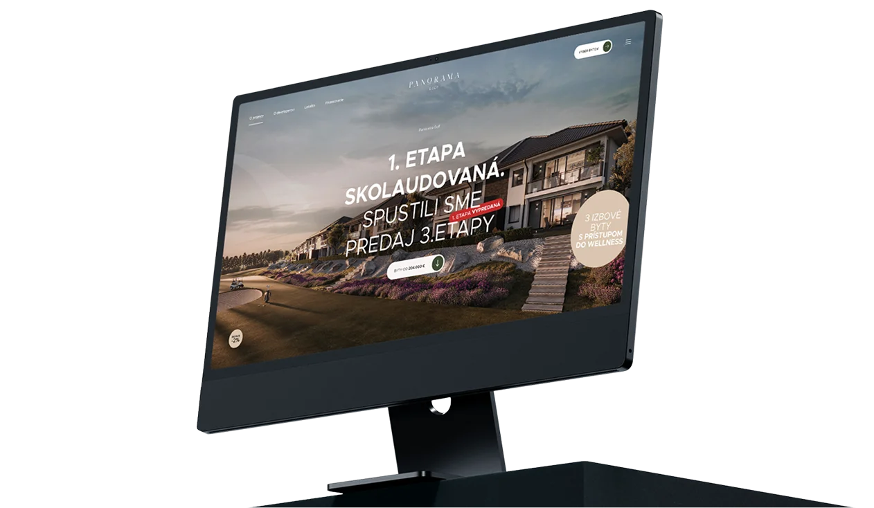
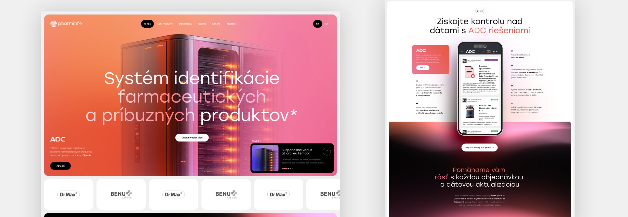
„There were definitely a few of them… But I clearly remember one client Pharminfo, which operates in the pharmaceutical industry. From a „layperson’s“ or standard perspective, a pharmacy would typically be associated with the colors green, blue, or perhaps yellow. However, this client’s scope is much broader and more interesting—it’s not limited to just medications and healthcare. Pharminfo specializes in the registration and management of pharmaceutical products. It then makes information about them available from a central source. I’ve explained it in a bit more technical terms, but the point is that their scope lies more in the technological sphere. That’s why I decided to approach their color scheme in a completely different way and chose orange and pink as their accent colors. Doesn’t it work? I’ll leave it up to you to decide whether it works or not 🙂 There are no limits to the imagination, and I’m personally thrilled with the result of this project.“
Mário:
„Before we decide to use a particular color palette, we have to be 100% sure that this choice will work and that these experiments will look good in the end. With clients, we don’t engage in experiments where we’re just trying to see how something will look. At the same time, what some might consider unconventional is, for us designers, something we’ve noticed elsewhere and that works well.“
Are there any common mistakes companies make when using colors in their visual identity?
Simon:
„There are a few… 🙂 It’s never a good idea when a client has an idea for their brand’s color scheme based on something like „I really like the color pink.“ Whenever possible, I try to accommodate these situations, but sometimes, unfortunately, it just doesn’t work and ends up doing more harm than good. Another big mistake—and not just when it comes to choosing colors—is that the client focuses too much on their competition. They feel that it works for the competition, and therefore, for their business to work just as well, they must use everything the competition uses… including colors. In my opinion, this is the wrong approach. We can draw inspiration from the competition, but we definitely don’t want to imitate them—quite the opposite.“
Mário:
„Generally speaking, I’d say that the most common mistake companies make is entrusting their brand’s visual communication to inexperienced amateurs. You may have the best product, a solid business plan, strong management, and excellent references, but if your design looks amateurish, there’s a high probability that people will view you as amateurs, too. This is especially true for emerging brands that need to establish themselves and solidify their position in the market. High-quality graphic design can sell virtually anything, because as the saying goes, “packaging sells.””.
Colors have tremendous power in graphic design. When used correctly, colors can elevate a brand to a whole new level. We believe that our designers’ ideas will inspire you to create bold and unique color combinations. If you have any questions or are looking for expert advice, Please feel free to contact us – We'd be happy to help you with your projects!
- RECOMMENDED
You might also like

  September 22, 2026
  September 22, 2026
  September 22, 2026